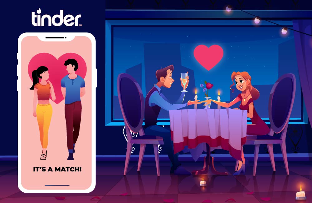
Online dating has been a booming market for years - but one app has put all its competitors in the shade: Tinder. In 2019, the app’s direct revenue was $1.15 billion. This is enough reason for a thorough research on the success factors of Tinder and an analysis of how to develop a really good dating app.
While most dating platforms go to great lengths to find the secret recipe for the most sophisticated matching, Tinder comes across as gratefully simple on the surface. Instead of complicated, data-heavy matching, the Tinderer is shown images of users who meet its criteria. Left swipe for the trash can, right swipe for a like. It's as beautiful and easy as turning steaks on the grill and maybe that's why it's so successful. Here are some of the reasons why is the taste for dating apps so great right now:
User habits have changed noticeably: While online dating always had a somewhat desperate undertone until not so long ago, it is now a matter of the technical possibilities of apps and the Internet.
Tinder is flourishing, and yet there is still plenty of space for a whole range of other dating apps, which have also achieved considerable success and download figures over 10 million.
There is nothing nicer and more important than love and everything that goes with it. Partnerships are the most important thing in life, which is why dating apps are becoming generally accepted.
The hook model, or: customer loyalty in the app
Trigger
The trigger is nothing more than the impulse to open the app. There are external triggers such as an advertisement or a recommendation from a friend to try the app and there are internal triggers; So those that come from the user himself. Boredom and loneliness are fertile ground here - the brain is looking for a shallow distraction and then, due to our mechanism of action in the app, we want to be there and - as a habit - let the user reach for our dating app.
For us, the external triggers are also important and you should use a handful of creativity on what occasion we can remind the user of the app. You can notify the user when he gets a like.
But if the user hasn’t logged in for a few days, a little tact is required in order to achieve the highest possible penetration without annoying the user. I t is important to let the user decide for themselves which and how often they want to receive a message.
Action
The external trigger should ideally and if possible, lead directly to an action that the user can perform. For example, he could claim a returnee bonus or activate a random profile if he reacts directly to our targeted trigger. You can imagine the "action" as in classic animal experiments: the mouse presses a button and receives the reward for it. However, it is important to recognize that the action of the user is required first to set the learning process in motion: Follow the trigger, perform an action and receive a reward.
To make it a little more vivid: the action can and should be something very simple. Clicking on a gift box, swiping to confirm or maybe shaking your smartphone to receive a coin.
Reward
If we have used a specialized (external) trigger, the reward should be adapted to this. In a dating app, however, it is already a reward if the user is suggested new potential dates or learns that he has been liked by other users.
It is important here that the user who comes to the app will certainly receive a reward. Do not allow the appetite for a reward to be unsatisfied and the user to be drained on an empty stomach. He'll quickly shove another bite in his mouth and with every hour that goes by, it becomes less likely that he will return.
Investment
And now the icing on the cake of the guided user experience: we use the momentum and the good mood after the reward and see that the user gives out something. This is the gravy that our app lives on in the end. Actually, that's even the roast. The user should now interact with the app by liking others’ profiles, chatting, uploading pictures. It doesn't matter what he leaves behind in the end. The main thing is that he invests something of himself.
This gives us two things: the user interacts with others and contributes his effort, opinion and information and would also like to know how they are received in the community. In the end, this is the strongest trigger for the users: to come back and see what has become of their investments.
Simplicity
When developing a dating app, simplicity is paramount. Every lag such as awkward menus, delayed loading times or cumbersome typing affects the user experience. The central fun object, at least with Tinder, is the iconic "Hot or Not - Swipe", with which men and women can easily and intuitively decide who they like and who not. It is not for nothing that it is said that the decision for or against a partner is made in the first few seconds, even offline.
But not only swiping, every other aspects of the app should also be intuitive to use such as connection to Facebook to get all information. There is no idle filling in of profiles and preferences but concentrating on the essentials.
Our developers at Hyperlink InfoSystem can assist you develop an excellent dating app similar to Tinder on the major mobile app operating systems such as iOS and Android. We have over 9 years of provide technological solutions for individuals, businesses and organizations in different sectors. An amazing dating app costs around $7,000.
 +1 309 791 4105


 +91 8000 161161
